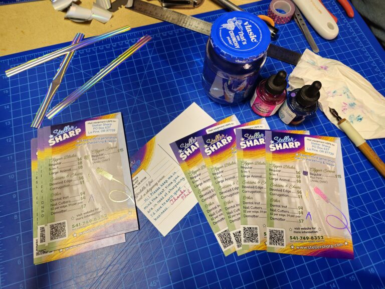
Address
Steller Sharp
PO Box 637
La Pine, OR 97739
Phone
541-749-8352
(text message for quickest response)
Address
Steller Sharp
PO Box 637
La Pine, OR 97739
Phone
541-749-8352
(text message for quickest response)
After 40 years in business, I figured it was time to create an official, branded logo.
After 40 years in business, I figured it was time to create an official, branded logo for my parents’ business. In the past we had a somewhat unofficial logo printed on our invoices. I believe it is just our company name printed in a typeface available from the printing company. Aspects of the old logo might have been designed or selected by “Papa” Steller (my grandfather), so there might be some historic or nostalgic value.
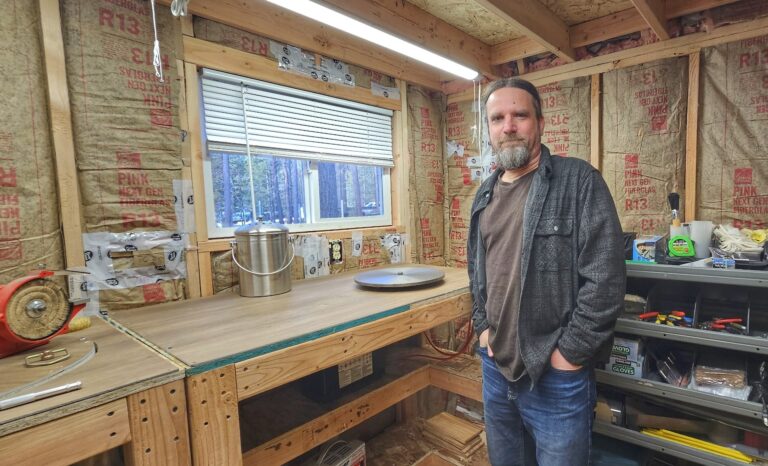
As a person with creative tendencies I have tinkered with graphic design software for almost 30 years. Without formal training or university schooling I built a career for myself wearing various hats such as web design, web development, graphic design, database administration, data entry, photography and other related headwear. Sitting behind a computer in an office every day for 20 years eventually wore on me, so I stepped away from that career path to return to the family business. I still tinker with a wide variety of creative endeavors, but now I do it on my own terms and only when I’m in the mood for it.
Lately I have lacked motivation to work on graphic design projects after severe burnout, but I finally forced myself to approach the important task. I was even able to enjoy the process once I got lost in the details of vector node editing. The design went through several iterations. I started by writing our family name in a manner somewhat similar to how it is signed. The basic outlines were created in Affinity Designer, and I added varied stroke thickness to create a calligraphic style. Imported into Inkscape, the letter outlines were traced and modified for an optically pleasing arrangement.
Only days ago I switched gears on which font to use for the “Sharpening Service” element of the logo. I started four years ago with a more traditional, blocky serif font. A recent experiment with a curly font to resemble the Steller name looked cool, so I went with it. As it turns out this font also looks pretty nice for headings on the website, so I made a web font out of it and voila!
The chrome effect was initially added via several overlapping Inkscape filters. This results in somewhat jaggy bitmap shapes that were traced to vector and meticulously optimized node by node to iron out rough artifacts.
As of today the logo actually looks good to me, a rare feat to achieve since artists and designers often endlessly refine their work, always seeing something “wrong” with it. Perhaps next week I’ll get tired of this variation and tweak it again, but hopefully not! Here are two earlier iterations of the logo, followed by an alternate horizontal format which currently appears on mobile devices with smaller screens.